Exploring possible human knowledge


Paul Vjecsner

COMMERCIAL ART

(continued9)

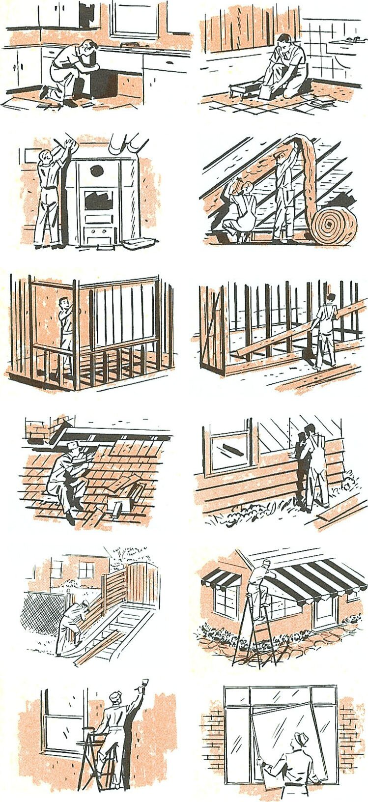
In keeping with the domestic theme of the drawings at the end of the last page, I am following up with illustrations for a banking folder regarding FHA home improvement loans, with other illustrations afterward.

The present two-color ones were titled, viewed from left to right downward, KITCHEN, BATHROOM, HEATING, INSULATION, ADD A ROOM, GARAGE, NEW ROOF, SIDING, FENCE, WINDOW AND PATIO AWNINGS, PAINTING AND DECORATING, and STORM WINDOWS. I enjoyed drawing figures in varied activities and settings, testing one's skill. Shadows are seldom drawn solid black, but I did it in absence of available midtones, and to add to the feeling of depth.

6 January 2005

HOME

PRESUMED IMPOSSIBILITIES, continued1, 2

PHOTOGRAPHY, continued1, 2, 3, 4

PORTRAITURE, continued1, 2, 3

COMMERCIAL ART, continued1, 2, 3, 4, 5, 6, 7, 8, 9, 10, 11, 12, 13, 14, 15, 16, 17, 18, 19, 20, 21, 22, 23, 24, 25

INVENTION

AUTOBIOGRAPHY, continued1, 2, 3, 4


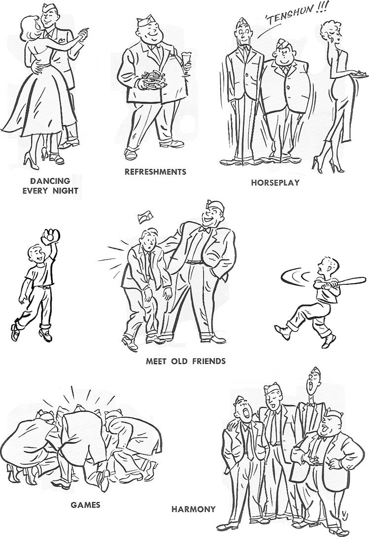
The next drawings were done for a three-day American Legion Annual Welfare Party. They are in a somewhat cartoon-like style, although retaining a realism in the figures, as in the folds in clothing, which have been of interest in art. The title at the bottom of each drawing was the printed one, the drawings of the two children, who were beneficiaries of the welfare party, having been printed on another page.


Following are mainly some other drawings, for items printed for Continental Air Lines. The layouts had largely a predetermined format, with little room for creativity.


At left is the cover for a flight schedule. It appears I was able to design the four partly tinted panels. If unnoticed, I might, immodestly again, add that my signature, VJ, is in the boy's panel, bottom right. (In the just preceding drawings it is with the last one; I was unable to locate a signature in the two-color ones at the top of the page.)

The first wider image below is from the inside of this schedule, above a flight map of the United States. I only recognize responsibility for the drawing on the left side, the pictures of airplanes were supplied. Automobiles were soon favorite subjects of mine, because their special shapes were difficult to draw in perspective.

The subsequent wide image is from a similar printed item, and this time I could design the unit, enabling me to contrast a bold typeface with the drawings, of which again I only did the football player.


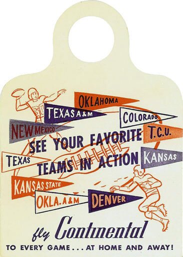
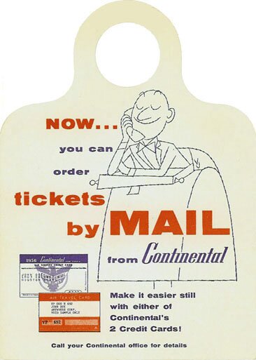
Football was also concerned in the first of the two baggage tags below, for which the drawing at left was done. In these cases it seems I was able to design the whole unit, although I don't know how in the first tag the brushstroke-simulating font for the word "fly" got in. I would not have used it. It was probably again part of the logo.

In the second tab the drawing, done with the "nervous line", is a little too cutesy for me, despite my signing it. I suppose I didn't think signing it would adversely affect me.


STILL MORE FROM DENVER

To the top and choices