|
PRESUMED IMPOSSIBILITIES, continued1, 2 PHOTOGRAPHY, continued1, 2, 3, 4 PORTRAITURE, continued1, 2, 3 COMMERCIAL ART, continued1, 2, 3, 4, 5, 6, 7, 8, 9, 10, 11, 12, 13, 14, 15, 16, 17, 18, 19, 20, 21, 22, 23, 24, 25 AUTOBIOGRAPHY, continued1, 2, 3, 4 |
|
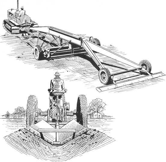 |
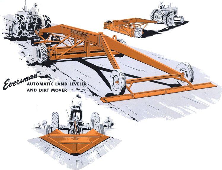
In the preceding two-color drawings, which include a gray tint, I let, as in former cases, a color or tint define some edges, without using an outline, which can be superfluous. Those images are about half the printed size. Those at left are close to the size of the drawings and use, as may be evident, the pen for middle-tones, some by often heard of crosshatching. |
|
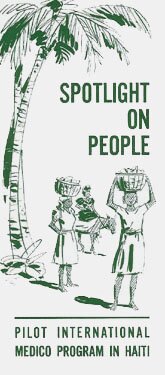
Speaking of crosshatching, in the following are two uses of it, this time without question for my last employers, who did work for CARE, the advertiser in these cases. 25 November 2005 |
 |
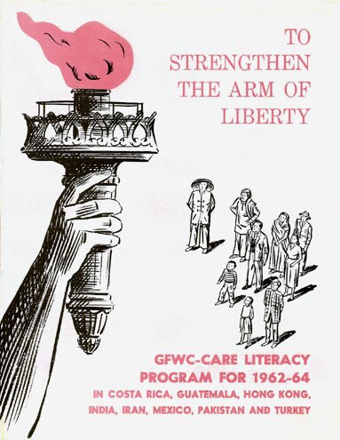 |
These are the covers of the advertising pieces, shown in full but reduced, too small for the details. Below are the drawings alone, in actual size. |
 |
|
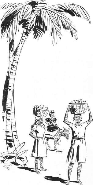 |
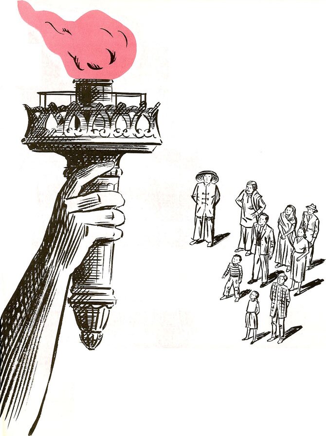
The crosshatching above is mainly in the arm with the torch (part of the Statue of Liberty of course), and unlike usual, is done with a brush, along with the rest of the drawing. I liked again the challenge of drawing the people in bird's-eye view. At left is a return to the pen, but the heavy black strokes are done with a brush. My VJ is noticeable under the palm, while in the preceding picture it is almost hidden in the bottom of the torch on the right. |
|
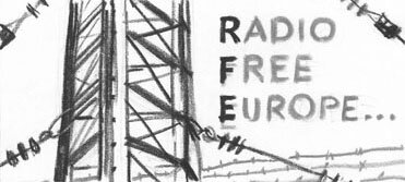
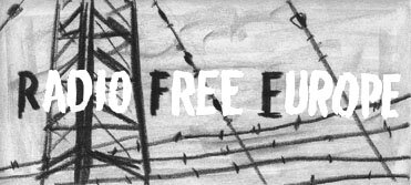
The preceding is an indication that my employers did a lot of work for non-profit organizations, and the following is among them, likewise with international content. The first four images are actually varied layouts for the same brochure, the sketches done with gray pastels and some opaque white. 29 November 2005 |
 |
 |
|
 |
 |
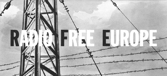 |
As evident from the finished brochure at left, it was the last layout that was chosen. The shadowy clouds were made to enable both the black and the white letters. |
 |
|
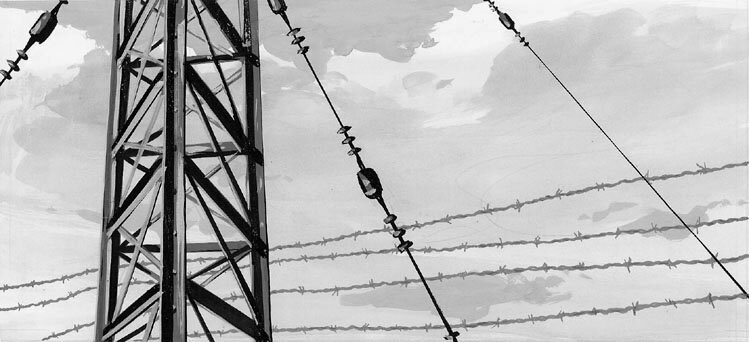
This painting of the background was done upsize in opaque watercolor. |
| MORE WORK IN NEW YORK | To the top and choices | |