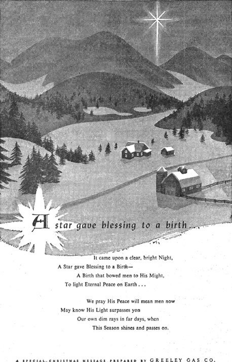
The picture at right was done with opaque watercolor, the heading pasted on an overlay and then "stripped in". I liked the challenge of bird's-eye views, as for instance in the last picture of the last page.
|
PRESUMED IMPOSSIBILITIES, continued1, 2 PHOTOGRAPHY, continued1, 2, 3, 4 PORTRAITURE, continued1, 2, 3 COMMERCIAL ART, continued1, 2, 3, 4, 5, 6, 7, 8, 9, 10, 11, 12, 13, 14, 15, 16, 17, 18, 19, 20, 21, 22, 23, 24, 25 AUTOBIOGRAPHY, continued1, 2, 3, 4 |
|
The picture at right was done with opaque watercolor, the heading pasted on an overlay and then "stripped in". I liked the challenge of bird's-eye views, as for instance in the last picture of the last page. |
 |
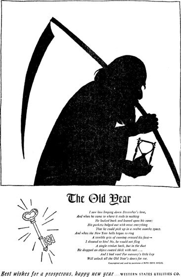
These scanned from newspapers, I let blemishes like lack of ink coverage stand, for often appealing authenticity. |
 |
 |
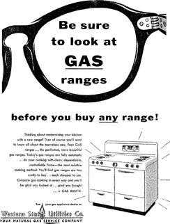
Advertising designers have known that a dominant picture, like of the glasses above, can attract attention.
At left, the boldface of the subhead was chosen by somebody other than me. It competes in emphasis with the main head, beside not being compatible in style, to diminish the effectiveness of the ad. |
|
|
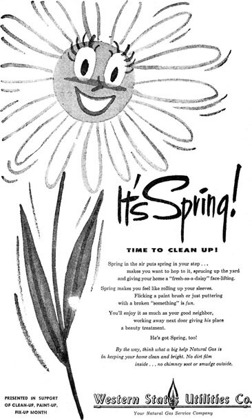
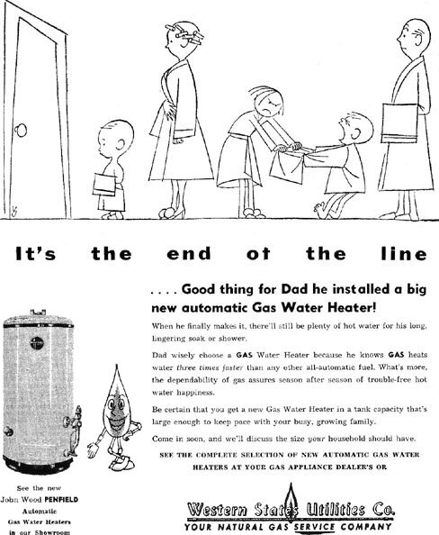
Following is a series of small ads mentioned with one of them before. That one did not include the gray tones of the present ones. |
 |
 |
 |
This natural-gas company had a still different name than the other two, but it was probably connected with them. |
||
 |
 |
 |
|||
|
Included below is some more miscellany done for these utility companies. The colored images are of a booklet, the first image showing the back and front covers. The two-part flame was likely not designed by me but furnished as part of the logo. To me its attenuated form is not aesthetically pleasing. 31 December 2004 |
 |
 |
 |
 |
 |
|
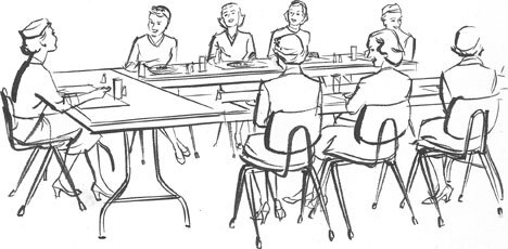
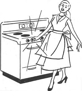
| The preceding two drawings are among some actual ones I was able to hold on to. They were usually done about twice the printed size. The one above can be seen used in the above booklet. | And this second one is in an earlier shown ad. | |
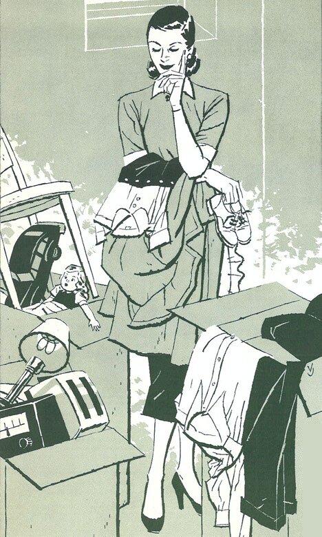 |
The drawing at left seems to fit in here. It was done for Goodwill Industries in Denver, showing a homemaker rummaging through discards which are hoped to be donated.
For this drawing I also used the "nervous line", with to and fro motion I mostly used for stylized and humorous drawings like previous "dishes". |
|
| To the top and choices | ||