Exploring possible human knowledge


Paul Vjecsner

COMMERCIAL ART

(continued22)

The preceding having to do with community services, it seems appropriate to continue with the subject. Following are illustrations from an annual report (1960) by the New York State Charities Aid Association. The drawings are accompanied by the corresponding headings, making the meanings self-explanatory. I should dutifully note that my VJ is back, with the last larger picture (of one per row).

18 January 2006

HOME

PRESUMED IMPOSSIBILITIES, continued1, 2

PHOTOGRAPHY, continued1, 2, 3, 4

PORTRAITURE, continued1, 2, 3

COMMERCIAL ART, continued1, 2, 3, 4, 5, 6, 7, 8, 9, 10, 11, 12, 13, 14, 15, 16, 17, 18, 19, 20, 21, 22, 23, 24, 25

INVENTION

AUTOBIOGRAPHY, continued1, 2, 3, 4


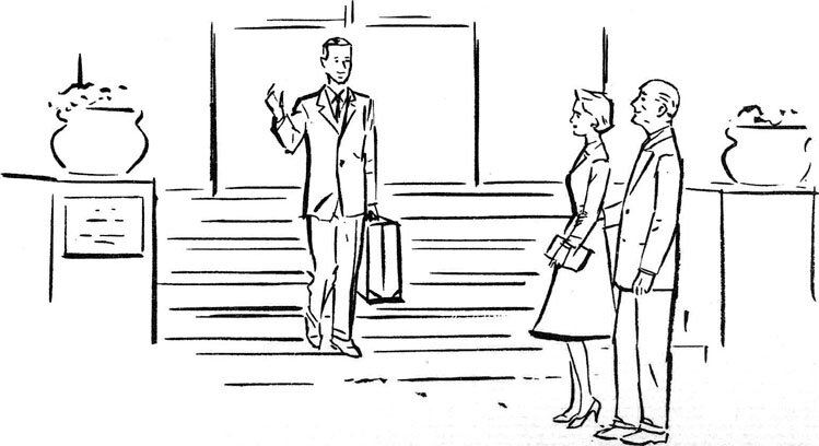
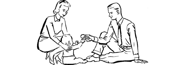
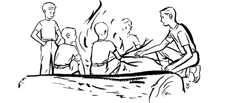
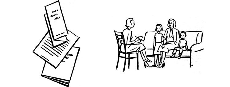
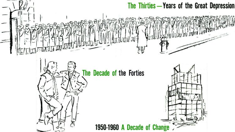
Below are illustrations for a booklet I designed for another community service organization, which seemed to include all such organizations in Greater New York (the five boroughs of the city). It was the time of mayor Robert Wagner.

14 April 2006


At left is the cover, which contained photographs in place of the tinted panels. I made the change so as not to distract from the drawing, with my proud signature next to the trashcan. The stairway also had distracting small type in front of the column, the removal leaving some white gaps there. The street-scene is not too dissimilar from photos I took out of my window recently.

The long line of job-seeking people in the inside drawings below makes me think of the line of people in the death march of 1944 I drew here in my autobiography. There is not much comparison of course, the march having been one of the horrors of the Nazi era. The two youths in the next drawing seem, with the leather jackets, more out the fifties or sixties than forties. I may not have known the difference, and nobody else noticed.


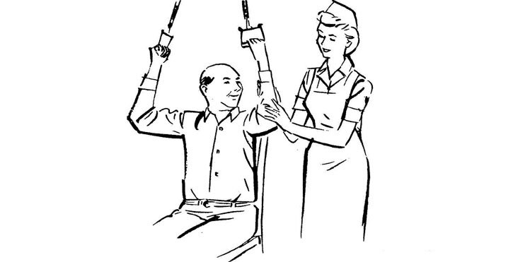
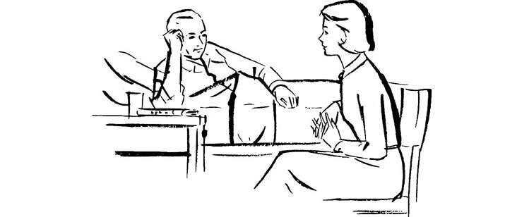
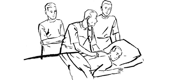
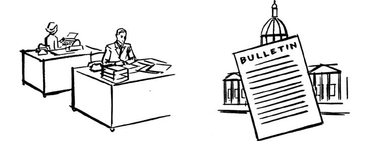
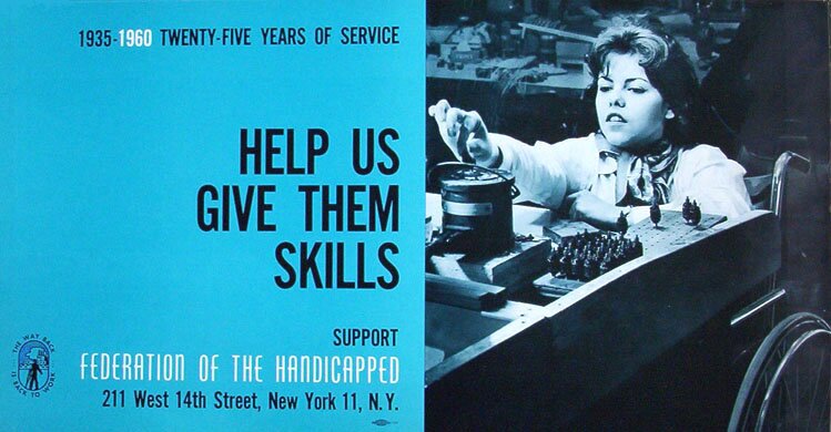
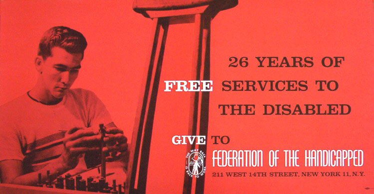
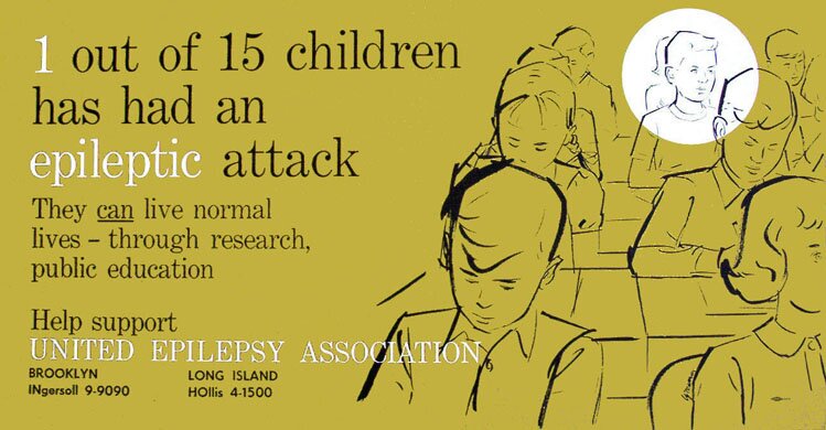
Next are added three subway cards I did that should complete here the work for community services. Such cards, these 21 inches long, are known to be placed in subway cars above the doors and windows.

The first one so impressed the woman representing the organization in the last card, that she looked up my company that had printed it, calling it stunning (the photo in this first card is printed in "duotone", using both colors, black and blue). Notwithstanding her enthusiasm, this customer for the third card turned out an insufferable dictator, trying to tell me how many lines I should use for the drawing, which I signed despite the problem.. 

11 May 2006


MORE AT THE SAME WORKPLACE

To the top and choices