Exploring possible human knowledge


Paul Vjecsner

COMMERCIAL ART

(continued6)

Following is work I did that was pictured in the last ad of the preceding page and, as informing there, accepted for the first Denver annual.

21 August 2003

HOME

PRESUMED IMPOSSIBILITIES, continued1, 2

PHOTOGRAPHY, continued1, 2, 3, 4

PORTRAITURE, continued1, 2, 3

COMMERCIAL ART, continued1, 2, 3, 4, 5, 6, 7, 8, 9, 10, 11, 12, 13, 14, 15, 16, 17, 18, 19, 20, 21, 22, 23, 24, 25

INVENTION

AUTOBIOGRAPHY, continued1, 2, 3, 4


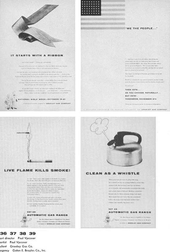
Four of some of the mentioned other ads for Greeley Gas Company. In the lower two, and more noticeably in the subsequent drawing of the dishes, I used a what is called "nervous line", which zigzags to and fro. One can easily control its direction, and it provides an informal contrast to the type or photographs.


The layout of the ad at far left was by my boss, with me doing the finish. I am uncertain whether I drew the beer bottle. I know I was attracted to the then often seen pictures of a cooled bottle with running drops of dewy water outside, and I may have wanted to try my hand at it.

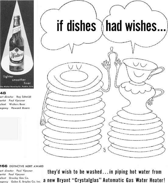
The drawing at left was, like a previous one, considered as illustration. It was from another Greeley Gas ad, faintly seen as the bottom item in the above mentioned ad on the preceding page.


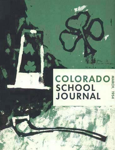
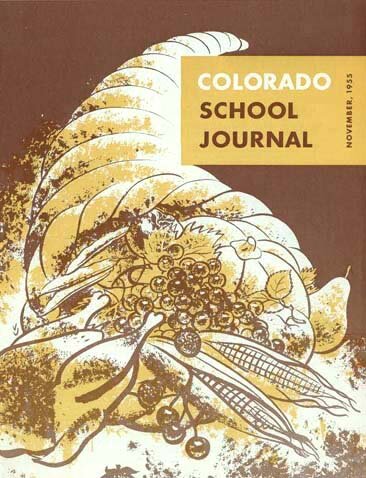
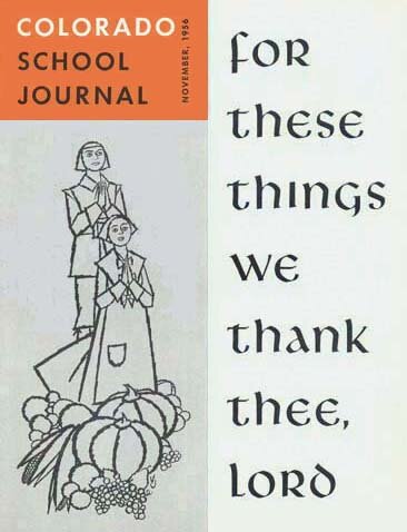
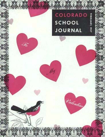
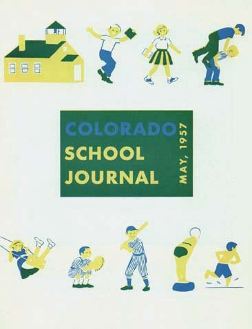
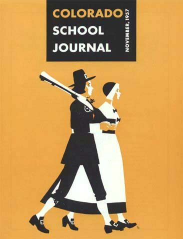
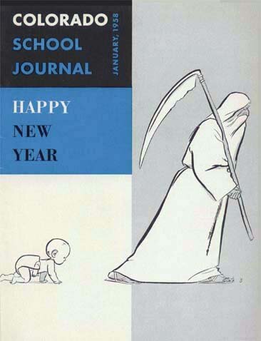
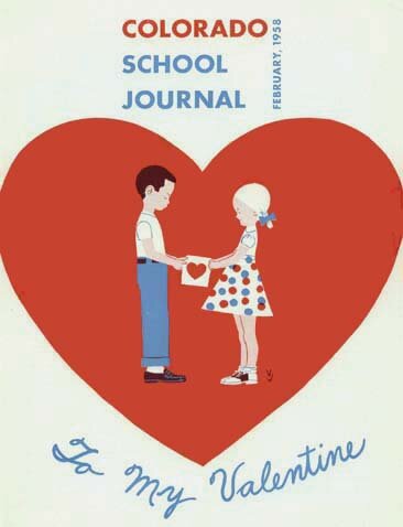
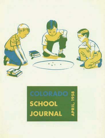
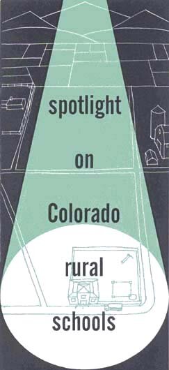
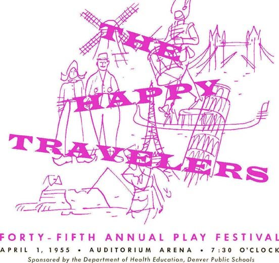
I was given the opportunity to design a number of these covers, including the title, beside some interior material. They were restricted to two colors, which I tried again to overlap in places to achieve a third color, similarly to the previous Passover program.

These reproductions were of course in black & white, but I will attempt to next include some in color, ones I favor in that respect over the present ones.


The colors in the following first three covers did not lend themselves to the mentioned overlapping for a third color, but I will underneath them describe other characteristics, beside more under succeeding covers.

It could be that I am seen as excessive in self-promotion and criticism of others, but I feel it appropriate to in view of my goals point to what I consider my capacities in comparison to shortcomings in some who find uncritical acceptance.

29 August 2003


This St. Patrick's Day cover lets the brushwork show, for a merry feeling set off by the stable title of the journal. Leaving accidental results of a technique untouched can add to its appeal, compared to its affectation as noted earlier. My VJ signature, not to be too modest again, is easily spotted on the left, as it is on the next cover but not on all of them.


Several of the covers were about Thanksgiving, as seen. The two colors in all covers were as before done separately in black, this time without halftones (tonal gradations), relying on other means instead.


Another Thanksgiving cover, with a religious theme, not likely used today by the National Education Association, the parent organization. The gray panel on the left was done by marking a black one for a "screen", applied by the printer. My VJ is between the grapes.


One of two Valentine covers here. Overprinting of red and black for a third color occurs only screened on two small hearts. A small VJ is behind the robin's left leg.


Here I took more advantage of overlapping the two colors, a blue and yellow, for a deeper green. The fuzziness is some weakness in my computer facilities or in my skill with them. I don't find a signature, although I am fond of this cover.


While this is only in two solid colors (black counts as one), it is my favorite among these covers. A challenge to me is to obtain the white by leaving out parts of the colors (I did something like it with a knight earlier). My tiny VJ is seen at bottom right.


The gray panel, shadows, etc. were again screened parts of the black plate. The old man seems a combination of the old year and Father Time. The VJ is again tiny at bottom right.


Another overprinting, of the red and blue, for a third color, now a distinct brown. As seen before, I was also given a lot of flexibility in using the magazine title. The VJ should be visible inside the large heart, bottom right.


My computer skills are once again lacking a bit, with the above blue, as in "COLORADO" or the highlight on the second boy's hair, more distinct in the original from the dark green result of the overlap. The VJ is below the third boy's left knee.


I am throwing in two, more mundane, advertisements I did for the association or journal. The above was a one-leaf flyer, possibly inserted in the magazine.


This was a "center spread" in one of the issues. Apparently I didn't sign the drawing, but I rather like working in such a simple, straightforward style.


Added below are a few more related items I managed to dig up, ones I did mainly for the same Colorado Education Association.

9 September 2003


The small colored image above represents one of the department headings inside the above school journal. I liked in portraiture to study not only usual facial features, but also ears, not well depicted by many, though a bad designer of an outdoor display of an ear once boasted to me about it. The second picture of an ear here, in the black & white ad, is just added as of the subject. I did it before Denver, in 1951, the year given on this rough proof.

The above drawings to the right are from booklet covers on meetings of the education association. Beside human features, I evidently liked sketching crowds as well, alongside other subjects.


The cover and interior heads of a booklet for the same association.


Finally, an image from another cover, of a brochure about related school happenings. The computer tends to darken edges of some color forms, a problem I have not yet been able to quite conquer, but it may not detract too much.

It just occurred to me that this image prominently exemplifies the varying slant of words used for a merry mood and noted regarding a poster as totally misapplied if used for tragic subject matter. Other considerations here and lacking in that case are the right expressiveness of color, and emphasis of the letters against the background.

   
MORE FROM DENVER To the top and choices