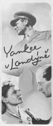
My copy of this poster at left was years ago cut into pieces by me when assembling a portfolio for job-seeking in this country. The gray picture of the painting above I took in Prague before typography was added in printing.
|
PRESUMED IMPOSSIBILITIES, continued1, 2 PHOTOGRAPHY, continued1, 2, 3, 4 PORTRAITURE, continued1, 2, 3 COMMERCIAL ART, continued1, 2, 3, 4, 5, 6, 7, 8, 9, 10, 11, 12, 13, 14, 15, 16, 17, 18, 19, 20, 21, 22, 23, 24, 25 AUTOBIOGRAPHY, continued1, 2, 3, 4 |
|
|
My copy of this poster at left was years ago cut into pieces by me when assembling a portfolio for job-seeking in this country. The gray picture of the painting above I took in Prague before typography was added in printing. |
||
|
It was customary then to limit the colors to two or three, mainly because some posters were transferred to lithographic stones with one color for each. The second poster above was thus painted in shades of two colors, black and an orange, though printed by standard offset. My name was not yet planted on the first poster, but is, printed rather than a signature, at top right of the second one. 10 April 2003 The countries whose films played there varied more than here. Following the preceding posters for English films, shown is thus what I feel almost certain was for a French film, and next for a Soviet one. Although the latter country was not yet in control, its influence was considerable, and many of its films were compliantly played, even if audiences were little interested. 17 April 2003 |
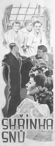
This is again a photograph I took of the painting before information was added in printing, which is why my uncertainty—I have no recollection of a finished poster. The title, of evidently a comedy, translates as "A Box of Dreams". |

The above is one of what could be called thumbnails I sketched before the posters. They were only about 4-5 inches long, not of the size here shown relative to the posters, which were about a foot wide. But on the back of this thumbnail I just found a record of my first two posters—the first one, noted above, was done in July of 1946, and the second one, unlike assumed, was the present one, done in August of that year. I began these then at age 20, before the preceding work for the youth weekly. For this poster I had multi-hued offset in mind for printing, but it was instead transferred to lithography, losing subtleties of gradation and color.
|
 |
||
|
For the next two posters I anticipated lithography by using only shades of three and four colors. In the first case lithography was indeed applied, a resulting finished copy not in my possession, without my regret, since I felt the result to be poor. The second poster was printed in offset, preserving the original better. The first one I remember as again of a French movie, and the second film was Soviet.
21 April 2003 |
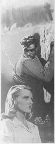
I don't know why I painted away for this photograph the title, which means "Vertigo" and is probably unrelated to the Hitchcock movie. |
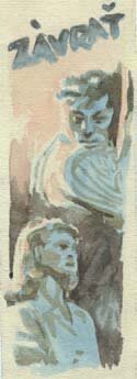
The thumbnail informs on its back that the poster was my ninth, done in November 1946.
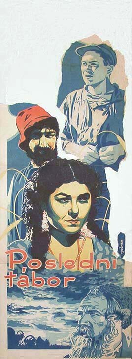
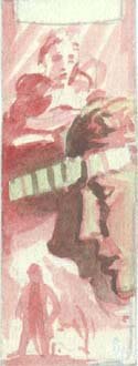
Of this poster I only have these reassembled patches, having torn it apart for again use in a portfolio when job-hunting. The title means "The Last Camp", and I think it concerned a story about gypsies. |
 |
||
|
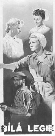
The following two posters are for well known American movies, Cover Girl (with Rita Hayworth, Gene Kelly and Phil Silvers) and the WWII So Proudly We Hail! (with Paulette Goddard, Veronica Lake, and Claudette Colbert), both evidently renamed because literal translations would not be meaningful in Czech. "Modelka" is the feminine form of "model", as in "fashion model", and "Bílá legie" means "White Legion", referring to nurses in white.
Rita Hayworth was very popular then in Prague. She even visited it while I lived there, and when she appeared in a window on Wenceslas square, the crowd in the street went wild with enthusiasm. 23 April 2003 |
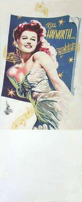 |
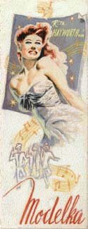
The back of this thumbnail, again, informs that the poster was my eighteenth, done in February 1947. The finished poster at left is another one intended for offset but transposed to lithography, and it is to me accordingly too crude in color and tonality, with resemblance to Rita lost. I used it regardless in my portfolio, which is one reason I cut the bottom off.
|
This design is one of the least to my liking—I would not now fade bodies out to fit in. But I feel there is no harm to including these for the record. |
|||
|
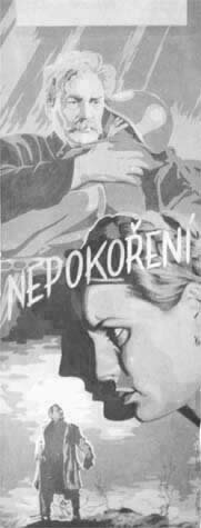
The next poster is likewise about WWII, this time via a Soviet movie. The title could be translated as "The Undefeated".
24 April 2003 |
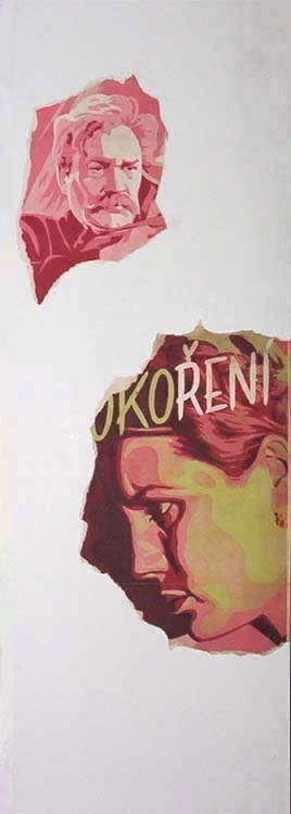
This thumbnail tells that the poster is an early, the third, one, of August 1946. |
Fortunately I have again this B&W photo of the painted poster before printed, with my finished copy at right reduced to two patches, used in the portfolio. My name in the above, unlike elsewhere, is imperceptible, consisting of the vertical slightly dark shape above the lower right corner. In contrast to the last described case, this poster was prepared in three basic colors, but printed in full process offset. |
|
 |
|
|
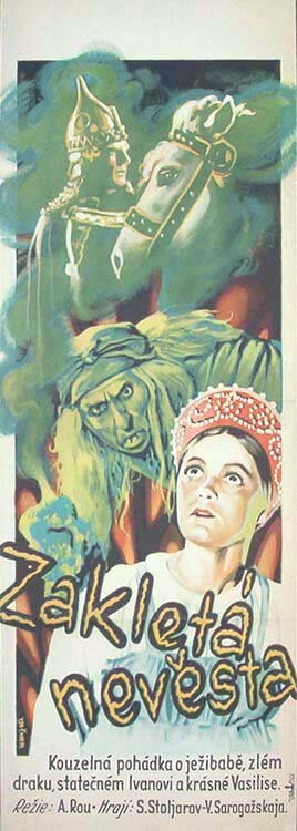
Following are two posters for Russian movies of fairy tales. The title of the first is Magician Kara-mor, and of the second The Enchanted Bride.
28 April 2003 |
| This poster did to my knowledge not make it into print. |
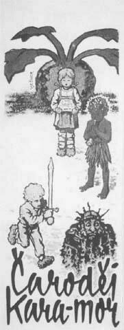
In the poster to the right it is interesting how the copy at bottom tries to sell the movie to possibly uninterested viewers: "A magical fairy tale about a witch, evil dragon, brave Ivan and beautiful Vasilisa". |
|
||
|
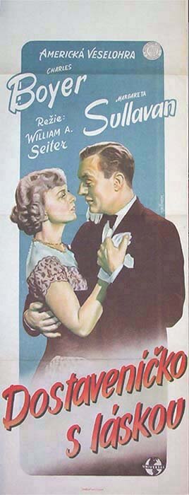
The last poster and the next one happened to be designed for as well as finished by process printing, retaining original values. The title in English of the below Boyer movie was Appointment with Love, and it was wrongly translated to something like "Date with beloved", missing the point.
Charles Boyer was around the war years the rage in Europe as "the great lover", as I remember especially from when a teenager in Hungary. His movies played well also in Czechoslovakia. 29 April 2003 |
| This is one time when I have both the photo of the painted poster and its whole printed copy. My name seems more visible on the photo here than in print—it is above the man's left shoulder. |
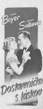
The poster was painted with a brown rather than black as deepest color. I used tempera, easily available there, on my jobs in general. It is water based and usable either opaque or as transparent water color. |
|
||
|
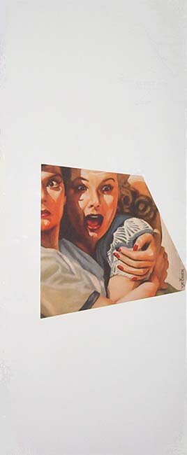
Also American is of course the next movie, My Sister Eileen, with Rosalind Russell and Janet Blair. The story was later made into the musical Wonderful Town by Leonard Bernstein.
30 April 2003 |
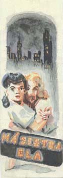
By the back of this thumbnail the poster was my fourteenth, done in December 1946. |
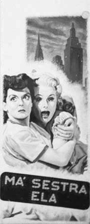
Luckily for me again, I have this black & white photo of the whole painting, having only, for the portfolio, the single cutout at right left of the printed poster. |
 |
||
|
Likewise a comedy was evidently the following Soviet movie. The title is the name of the leading girl in the film.
2 May 2003 |
| This photo again keeps the whole painted poster, my printed version at right having been torn up by me for my portfolio. |
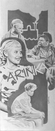
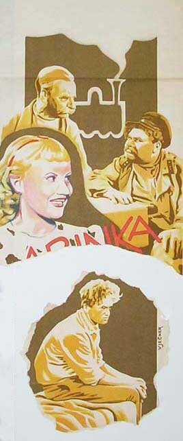
It seems I used the lower patch in the portfolio. The poster is another one prepared with a few distinct colors, the blue in the girl the darkest, but it was printed by full-color process. |
 |
||
|
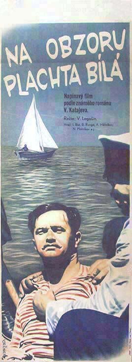
The title in the next poster, of a Soviet movie once more, can be read as "White sail on the horizon".
6 May 2003 |
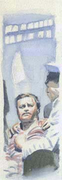
This thumbnail says the poster was my thirteenth, made in November 1946. |
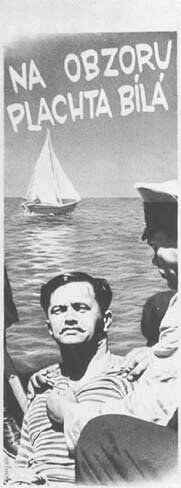
The photo of the painted poster and the printed one once again fairly match but for the added copy in the second. |
 |
||
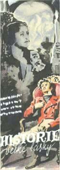
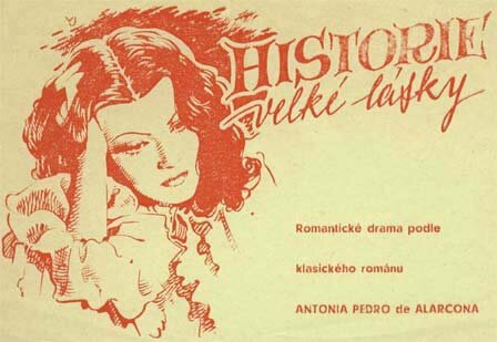
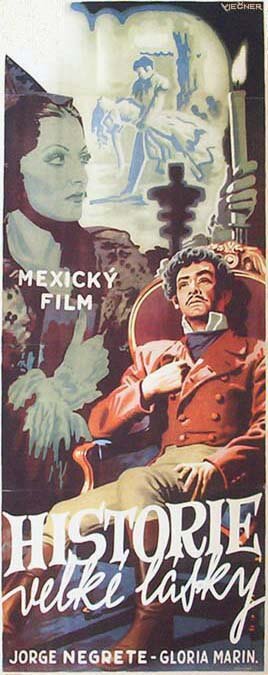
| Following is what may have been my last advertising for movies in Prague, this of a Mexican film as the poster makes clear (I am not responsible for the misalignment of those two words). It is after a novel by the known Spanish writer Pedro Antonio de Alarcón, but I cannot vouch for the authenticity of the title, "History of a great love". |
 |
|
|
|||
|
This should mark the last presentation of my career in Europe. I will try to continue these pages with work in the field I did in the States until I decided to quit the activity, to engage in other pursuits.
8 May 2003 And here is more, |
To the top and choices | |