Exploring possible human knowledge


Paul Vjecsner

COMMERCIAL ART

(continued20)

At the end of the preceding page I included some layouts done before a finished job, and inclusion of the following layout seems still more appropriate, because it is rather fancy in view of its mere use for a business card (there may have also been the usual letterhead and envelope, but I don't have or recall them). I was interested because the card, in particular the picture, could be printed in a few colors, though not in halftone.

30 November 2005

HOME

PRESUMED IMPOSSIBILITIES, continued1, 2

PHOTOGRAPHY, continued1, 2, 3, 4

PORTRAITURE, continued1, 2, 3

COMMERCIAL ART, continued1, 2, 3, 4, 5, 6, 7, 8, 9, 10, 11, 12, 13, 14, 15, 16, 17, 18, 19, 20, 21, 22, 23, 24, 25

INVENTION

AUTOBIOGRAPHY, continued1, 2, 3, 4


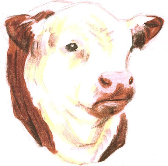
I probably had one or more black&white photographs to work with, making this, likewise pastel, layout drawing (approximately this size), to be turned into a little printed illustration in three colors, a dark brown, a reddish brown, and yellow, with possible tint.


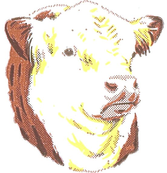
The greatly enlarged printed version. The dark brown is also used for a tint, here seen as a dotted screen, but drawn on an overlay in solid black, like the other colors.


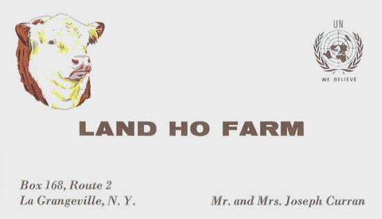
This image of the business card is of course also enlarged, because the details would otherwise not show up on the monitor. Mr. Curran may have been a political figure in New York.


Following is another layout and finish done in several flat colors without a halftone. I am including this because designing it in that manner, for a cutout finish over 2 1/2 feet long, was somewhat tricky. One of my bosses marveled at how I planned and put these colors together by use of solid black overlays, and he called me a genius. The layout was smaller and done of course in color.

14 December 2005


It was not done with pastels, like the preceding ones and as is frequent, but, on usual thin paper, with opaque watercolor, some of which is here visibly chipped off. The white highlights were on the layout painted over the colors, but for the finish they were left out areas painted around on the concerned layers. The only tint was for the green shadows on the screw cap.


Considering in the preceding on this page the use of overlays for colors and tints, all drawn in solid black, these can also be combined to achieve various hues by overprinting with as few as two colors. Some of this I did for covers of a Colorado school journal, and below are used only black and an orange, with tints of varying intensity independently or combined.

15 December 2005


It was done for a booklet by The Play Schools Association, providing children with experiences during out-of-school hours. Here the grouped children and the title to their right (and the released balloon) make up the front and back covers; the boy at right starts the inside front cover, which is why his cut-off head. The computer may alter the colors a bit, but the solid orange appears in the third child from left, all other colors resulting from the different intensities.


MORE FOR PLAY SCHOOLS ETC.

To the top and choices