Exploring possible human knowledge


Paul Vjecsner

COMMERCIAL ART

(continued17)

Following are some more drawings done for Mountain States Telephone, this time for the Denver telephone directory. As usual for the directories, the paper used seems newsprint, the kind used for newspapers, and therefore the ink coverage isn't quite smooth. As elsewhere, I feel that correcting this would tamper with authenticity, which can have a certain appeal anyway.

These drawings can again be obviously considered corny, but I have less aversion to such sweetness now than in the past, especially in light of the loose morality that has overtaken today's culture.

3 November 2005

HOME

PRESUMED IMPOSSIBILITIES, continued1, 2

PHOTOGRAPHY, continued1, 2, 3, 4

PORTRAITURE, continued1, 2, 3

COMMERCIAL ART, continued1, 2, 3, 4, 5, 6, 7, 8, 9, 10, 11, 12, 13, 14, 15, 16, 17, 18, 19, 20, 21, 22, 23, 24, 25

INVENTION

AUTOBIOGRAPHY, continued1, 2, 3, 4


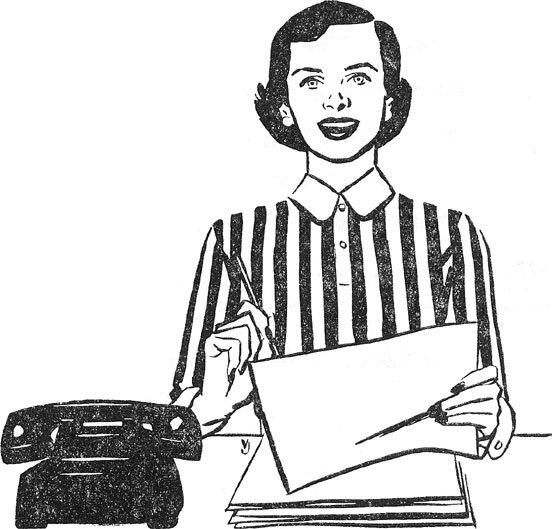
At left is pictured a telephone service representative. Sometimes I use devices like having an outline defined only in part, here of the blouse by the stripes. It can add interest to the patterns.

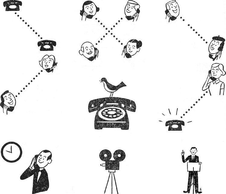
Below illustrated are various telephone services. Reading roughly from left to right, they are station-to-station and person-to-person calls, telephone get-togethers, overseas and collect calls, beeps with recorded calls, time-saving tips, available movies about services, and speakers on the subjects.


Still more of work I did in Denver is the following for what was advertised as "Since 1910, the West's Leading Investment Bankers", similar to the previous investment subject. Their name was Boettcher and Company, but I left it out here along with most copy for these ads, since it does not contribute to the intended visual presentation.


At far left the drawing was for an ad about an investment plan for families.

The second image seems self-explanatory, used to advertise investment in bank stocks.

   
Here the far left drawing brings me back to the telephone. It is about calling the company collect for investment information.

The next image, with the gyroscope, was for advertising municipal bonds.

In these two drawings I again simulated woodcuts, as before shown on a movie ad and one for Halloween. The technique is suitable in this case for the sense of firmness.


This below last drawing for that company is again self-explanatory. It also has me draw hands as before, as well as buildings and other objects in perspective, which interested me. Except for the "woodcut" pictures, my VJ also can be found in these.


Speaking of buildings and so forth in perspective, as well as of banking, the next images are about the bank named in them, and are mainly of one newspaper ad, seen bottom left. I did not design that ad, but only did the separately shown drawings.

11 November 2005


The first image is clearly from the top of the ad, and what I might say is that it has my VJ at right. I did not even choose the gray panel at right, which was part of the layout.


The following line drawings are somewhat enlarged, to display the details of the interiors, the perspectives of which, too, I found challenging to draw.


As my disowning this ad may suggest, I am not pleased with its layout, which I find a mishmash although I may have picked the fonts. How the heading got pushed into the building I don't know. A badly fitted overlay maybe.


This last drawing is from another ad for the bank, and I thought it would fit in here.

     
MORE BUILDINGS IN DENVER To the top and choices