|
PRESUMED IMPOSSIBILITIES, continued1, 2 PHOTOGRAPHY, continued1, 2, 3, 4 PORTRAITURE, continued1, 2, 3 COMMERCIAL ART, continued1, 2, 3, 4, 5, 6, 7, 8, 9, 10, 11, 12, 13, 14, 15, 16, 17, 18, 19, 20, 21, 22, 23, 24, 25 AUTOBIOGRAPHY, continued1, 2, 3, 4 |
|
|
|
|
|
|
|
|
|
|
|
|
|
 |
 |
|
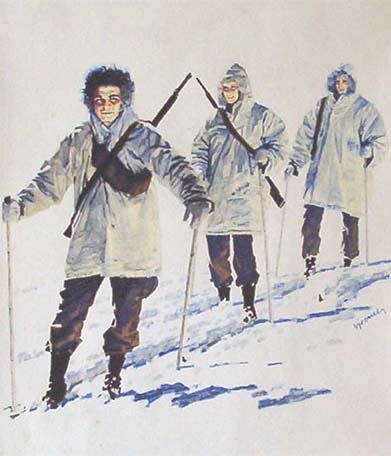
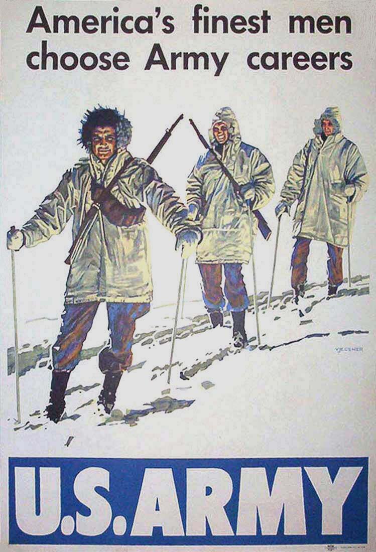
23 June 2003 By chance I found a remnant of the actual design shown immediately above and like the preceding one made twice the finished size. I inscribed my initials PV, referred to earlier below as sometimes used. They read downward between the figure's belt and the large "A". The last (now next to last) above image is of the actual drawing, made twice the finished size. On scrutiny, one can still notice compass holes inside circular shapes in the title. The spottiness of India ink in solid areas is also visible. In this case I worked the letters VJ in for my name as referred to on the previous page, not that I am fond of this picture. The two letters are on the top of the soldier's left shoulder. My second phase in the army is to follow. 19 May 2003 The second phase began on my seeing in an Army periodical an ad for an artist by the Recruiting Publicity Bureau, stationed at what was then Fort Jay on Governors Island, south of New York City. I went there to apply, and was given some artwork to do as a test. The liked it and had me transferred to their location. The workplace was somewhat small, with only a few other GI artists, while as far as I know I was the only resident one who was given the chance to have a recruiting poster printed. They let me try ideas for these, based on all kinds of (black & white, as I remember) photos they obtained. The following two drawings—or call them paintings—are so-called comprehensives I did of my suggestions for posters, without copy added. |
|
 |
|
| The second of these drawings appealed to those in charge, who then let me paint the poster below. The reproduction may not be the best and I remember liking the sketch better, but I was glad, of course, that the poster materialized. |
 |
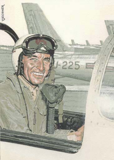
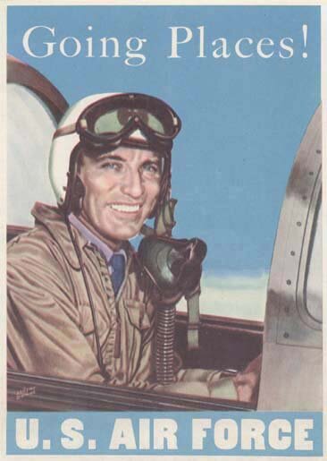
| Another comprehensive of mine was the first picture below. My name on it seems a bit bold, but the picture is only about the size of a mouse pad—to use a contemporary analogy. In contrast, the posters are about 18 by 24 inches. |
 |
|
|
|
This poster, however, was not finished by me, I think because they wanted a named illustrator to do it, but a factor also may be that I became hospitalized. Anyway, the illustrator was Albert Dorne (his signature at bottom left), who was then almost as famous as Norman Rockwell. He was said to be the highest earning commercial artist at the time. Although he had considerable skill, the viewer may agree that the painting is rather undistinguished.
Mr. Dorne was nice to me, though. He liked my work and after my discharge tried to help me with some referrals, if unsuccessfully. 23 May 2003 While at Fort Jay, as mentioned, I became hospitalized, for colitis. The hospital I was soon sent to, and stayed in until given a medical discharge from the Army a few months later, was in Fort Devens, Massachusetts. During that time, no longer as a job, I did artwork voluntarily, mainly in a recreational facility run by the Red Cross for the patients. But I thought to first include here two door-signs I did for rest rooms in the hospital and done in a lighter vein than the preceding, the same applying to the Red Cross work that follows them. |
|
For these drawings I utilized my initials PV in upper corners as a signature. But usually I used the mentioned letters VJ, if not fully my last name. |
||||||
 |
10 June 2003. This is a little item I found after the other images here and done in the same period, and likewise signed with my initials. The sketch is printed on two small facing pages. |
||||||
|
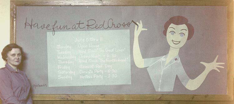
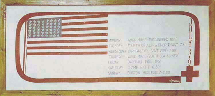
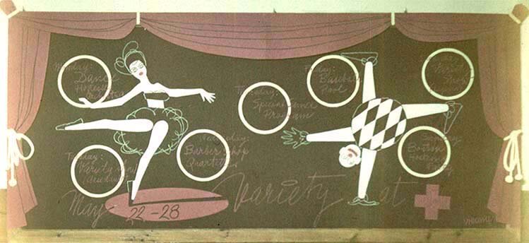
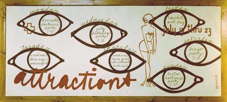
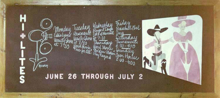
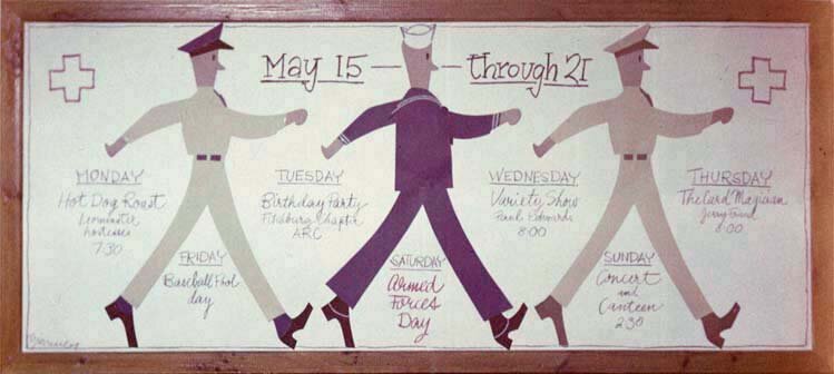
What follows are displays I did in that Red Cross facility. They were made with cutouts from colored papers, the glitter from staples used showing in places. The very nice looking nurse on the left in the first image stood there for me to indicate the scale of the displays for the photographs I took (in the display the nurse writing seems to have missed a "the" in front of "Red Cross"—it could surely not be my fault).
This was so long ago, over fifty years, that the pictures on the small transparencies badly faded since, the computer enabling me again to restore the colors as much as I could, with some of the edges still faded. |
|
 |
 |
 |
|
 |
|
In the last above display the marchers represent the Army, Navy, and Air Force, as many viewers probably know. I took the photographs at the time in order to, evidently, use them in job-seeking after the military service. The designs were received favorably by some known art directors, but what may have worked against me was that I was desperate to hold a steady job instead of free-lancing.
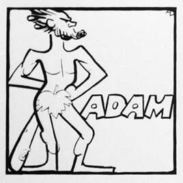
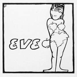
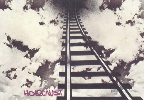
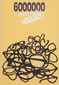
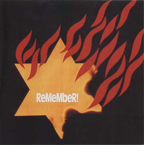
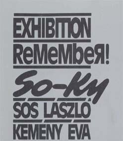
30 May 2003 This leads me to the observation that the dispensation of justice, as in other worldly affairs, need also not be equitable when it comes to success among fellow humans. This website, as indicated on the home page, is built on my awareness of the difficulties in gaining acceptance of what I offer. It being clear from what I said that I think that what I offer has exceptional value, I can remark that I see my difficulties greatly attributable to the drastic departure of those offerings from the accustomed, and especially from current trends. Conversely, I find that those who work in accepted modes have an easier time succeeding. Because of the present subject matter, graphic or commercial art, I am led to a situation regarding relatives of mine, who were partly at issue when I wrote on the first page for my career in art about my postwar stay in Budapest. Specifically, this has to do with a second cousin and her husband, who work likewise in the field. The cousin, Éva, had no artistic inclinations, but began the career with her husband in, I believe, her thirties. Neither of them can really draw, relying mostly on plain cutouts combined with given photographs. They regardless have had considerable success, and in my view—sour as this may sound—not quite deservedly. They began under the communist regime and became extremely zealous supporters of it. This may have helped in their success, extending outside of Hungary. In any event, I want to concentrate on their work. Under communism their work was almost exclusively propaganda for it, and later they sought other subjects. Recently a subject has been the Holocaust. This of course hits me very closely, but it also offers an occasion for my criticism. Above I suggested that stylish work has a better chance of success, and my complaint is that their work, represented below, takes from recent styles without justification with respect to the job at hand. A major concern in good design is that all parts work together in whatever is to be conveyed. This is not achieved if designs are copied regardless of whether suitable for the project worked on. A chief objection of mine regarding the below designs is that they use a playful style—of lettering in particular—which is totally out of place. The word "Remember" in the following two designs on top is to apply to the Holocaust. But the play with upper and lower case and so forth was invented by others for entirely different purposes, as can be lettering in a children's book. Similarly is the lettering in "Holocaust" for the other designs unfit. There is no justification for nesting an "O" in the "L" in those posters. Other things as well are objectionable to me. The first image was even to me, who is so close to the subject, unclear as to its meaning. At first I thought it was about a Soviet star. Then I realized it was to be the Star of David, which, however, consists traditionally of two overlapping triangles, seen on the Israeli flag. The presently shown star would rather be the yellow one the Nazis made us wear. Accordingly one would gladly burn the thing. The design could be clearer if the word "Jude" (Jew), put by the Nazis in their brutality on the star in the style of Hebrew letters, were included. As someone acquainted with aesthetics for a lifetime, I might also comment on some finer points. The logo So-Ky, below right, simulates direct brush strokes, but someone sensitized can tell it is done otherwise. Such pretended techniques are bad in art or design, and a good type designer would not be pleased with the result either, like the narrow neck in the "S" (my earlier lettering of "Grafika" may illustrate more balanced brushwork). Below find more comments. (This is a later addition—I chanced upon a Japanese company's trademark, TaKaRa, with obviously the alternate use of upper and lower case of the below twice seen "ReMeMbeR". A trademark is meant to distinguish its design from others, and the rhythmic small "a" in the preceding one is clever. But it is entirely unsuitable to imitate in the present images, with yet randomly small "b"s and a reverse "R" [Я], in a game the opposite of the serious content.) |
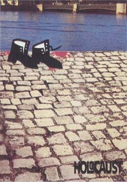
The top-heavy shapes in the number 6000000 above are likewise uncalled-for, forgiving the omission of wanting punctuation marks by non-English speakers. But the poster's design as well is again unsuited. The varying slant of words is another device created for light-hearted content, and the beige background and faint white lettering, too, are not expressive of the subject matter. The image with the rail is again unclear as to its meaning, other than, to me at least, evoking transports to Auschwitz. And the lettering style, once again, is unrelated not only for the nesting mentioned, but for the playfulness of the whole word and its purple color. In the last image the content is once more unclear to me, and it is regrettable that the drawing or cutout of the shoes is not only playful but tantamount to humorous, as in the last two displays above. And the meager text is insignificantly lost in the corner. |
(See applications of playful lettering like the here discussed, and which I recently noticed, in drawings I did years ago.) |
|
|
It has been a matter of pride in European posters to say as little in words as possible, relying on the picture instead. Although I question the absolute wisdom of this, people often desiring more verbal information, the pictures should at least be thoroughly planned to be appropriate and understood with ease.
These are issues arising in commercial art, which I view as at least as honorable as what is known as fine art, in which competence and responsibility can be absent or subjectively judged. 4 June 2003 |
To the top and choices | |