The companies had a Disney-like symbol of a smiling flame, which I adapted to the situations.
|
PRESUMED IMPOSSIBILITIES, continued1, 2 PHOTOGRAPHY, continued1, 2, 3, 4 PORTRAITURE, continued1, 2, 3 COMMERCIAL ART, continued1, 2, 3, 4, 5, 6, 7, 8, 9, 10, 11, 12, 13, 14, 15, 16, 17, 18, 19, 20, 21, 22, 23, 24, 25 AUTOBIOGRAPHY, continued1, 2, 3, 4 |
|
The companies had a Disney-like symbol of a smiling flame, which I adapted to the situations. |
|
|
 |
 |
|
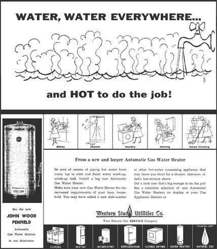
The four small drawings in the first ad directly above were repeated in the second ad, except for omitting the gray tones and adding a "shaving" panel. Unlike in the preceding two ads, I added my VJ signature, vaguely seen in the first ad under the middle of the tub, and noticeable in the other ad below the large faucet. |
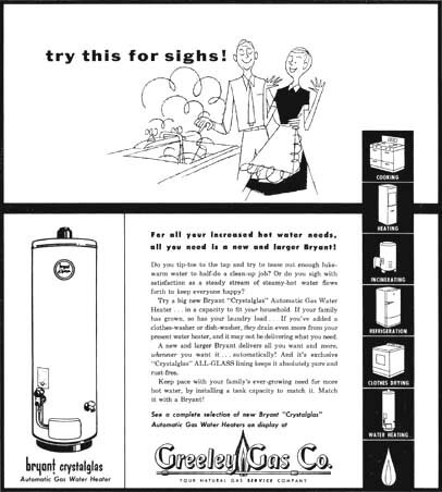
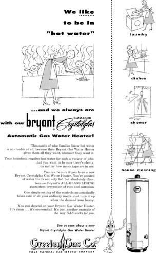
The preceding ad also included the seven black panels seen in the present two images. My VJ seems only present here at the bottom of the "Lady" drawing, done no longer with a "nervous" pen, but with a brush. |
 |
|
|
 |
|
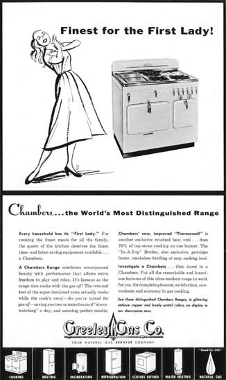
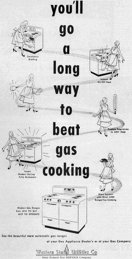
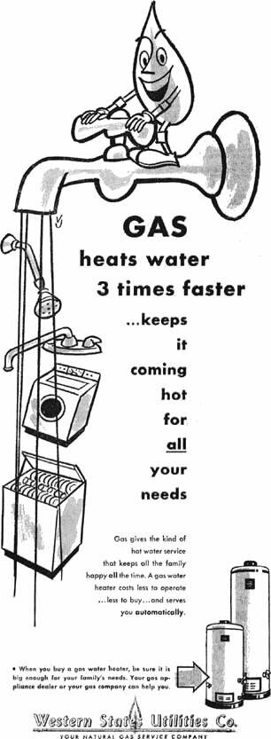
For now these are my last two ads for appliances. Like other subjects, I liked the challenge they offered in such as perspective, side by side with drawing the human figure. Evidently, I also liked humor for a change, as in the chance of drawing the large flame symbol in the second ad in a novel setting. My VJ should be easily found in both cases. |
|
These utilities companies occasionally presented special messages in the public interest, exemplified by the first two ads in the above mentioned previous ones. Below see more of the designs, with additional comments. 2 October 2003 |
|

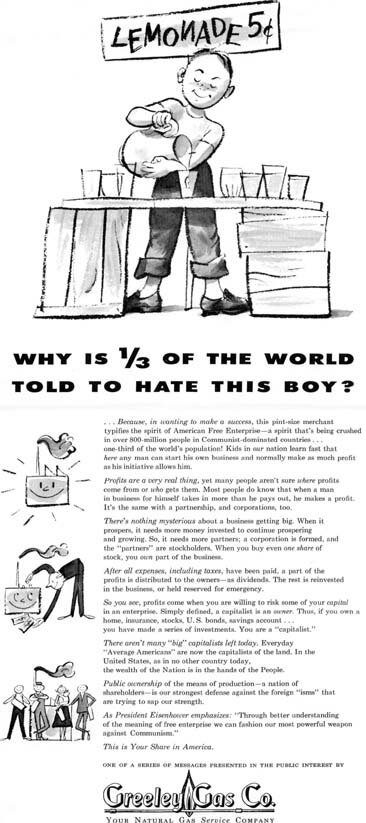
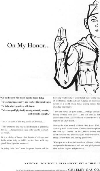
In the picture of the boy with the lemonade stand above left, his sign represents the willy-nilly writing of a child, like the reverse "N", which I noted as totally out of place in posters about the Holocaust, for which a solemn style, as on the earlier Passover cover, is expected. These drawings at left are done with crayon and wash for halftones, whereas the above is solid black in a woodcut manner, often used for children's books. My VJ is obvious there at lower right, but seems absent in the other ad. |
|
 |
 |
|
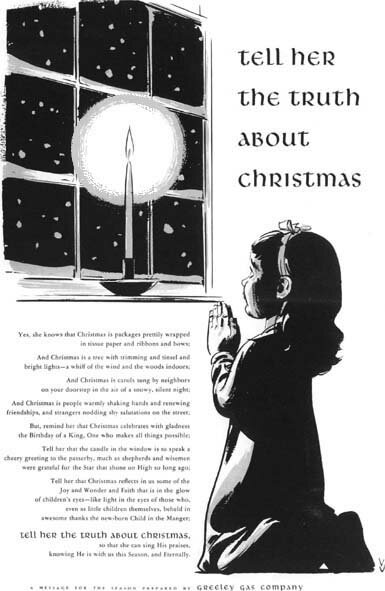
It is evidently not absent in these two ads. The left drawing is of course also solid brush line; the second one adds a grey tint done solid on an overlay, as were noticeably several preceding drawings. I like drawing children, as my images may show. |
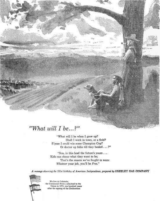 |
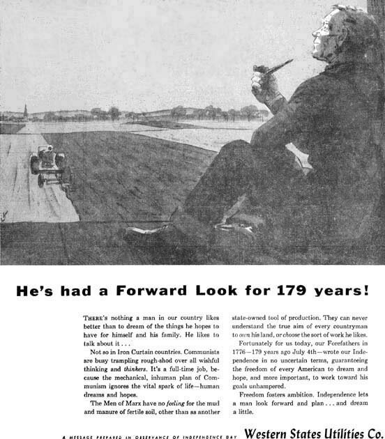
This and the next illustration were done in water color alone, without additional line work. They are among some that celebrate Independence Day. This one again lacks my signature. |
 |
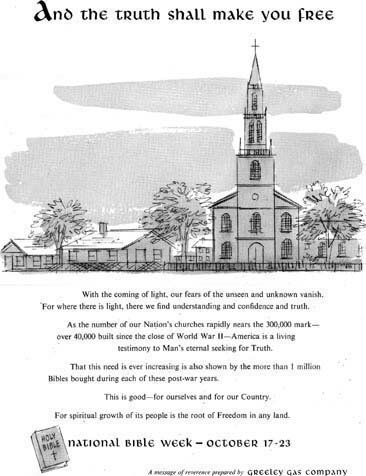
The images of both of these ads, like some previous ones, are scanned from newspaper pages and therefore are not as clear as those taken from engraver's proofs. I tried to remove by computer some of the blemishes, mainly in white areas around the type, but the pictures still reveal the roughness, which I left alone so as not to alter them. |
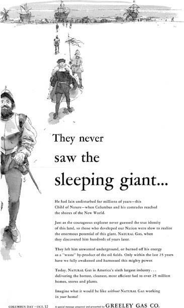
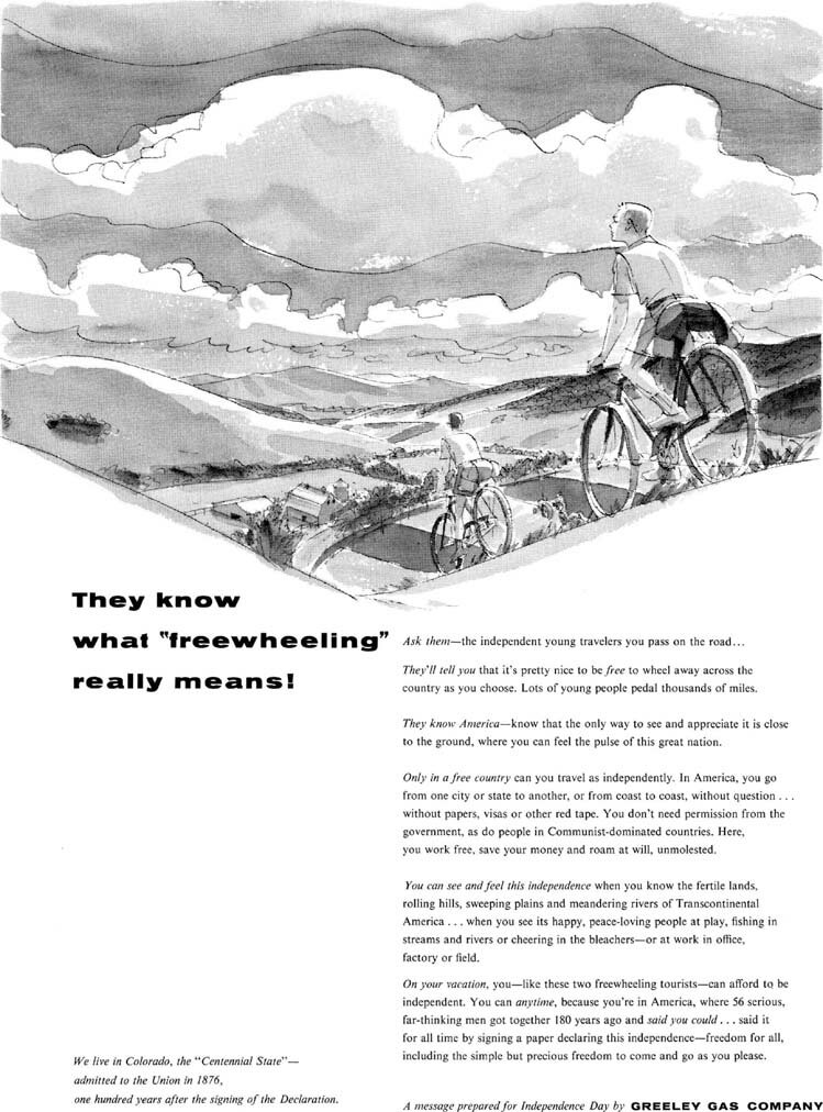
These last three designs return to pen and wash drawings, used for instance in my earlier illustrations for the Czech magazine. For those I did the color watercolor on an overlay, in order to make the black pen drawings crisper in printing. My VJ's in the present drawings are over the leftmost house above, next to the warrior's leg at right, and in the lower inside of the last wheel below. |
 |
|
|
| STILL MORE FROM DENVER | To the top and choices | |