Exploring possible human knowledge


Paul Vjecsner

COMMERCIAL ART

(continued10)

Similarly to the drawing in the last image, the below resumes the "nervous" line with a partly humorous style. What may seem silly is that in this booklet the opponent of prohibition is portrayed as an arch villain though, perhaps overeagerly, merely disapproving of alcoholism. But this is how advocates on any side often get carried away.

14 January 2005

HOME

PRESUMED IMPOSSIBILITIES, continued1, 2

PHOTOGRAPHY, continued1, 2, 3, 4

PORTRAITURE, continued1, 2, 3

COMMERCIAL ART, continued1, 2, 3, 4, 5, 6, 7, 8, 9, 10, 11, 12, 13, 14, 15, 16, 17, 18, 19, 20, 21, 22, 23, 24, 25

INVENTION

AUTOBIOGRAPHY, continued1, 2, 3, 4

     
  Accordingly I drew the prohibitionist in the form of a caricature, as on the cover at left, with other figures more straightforward.

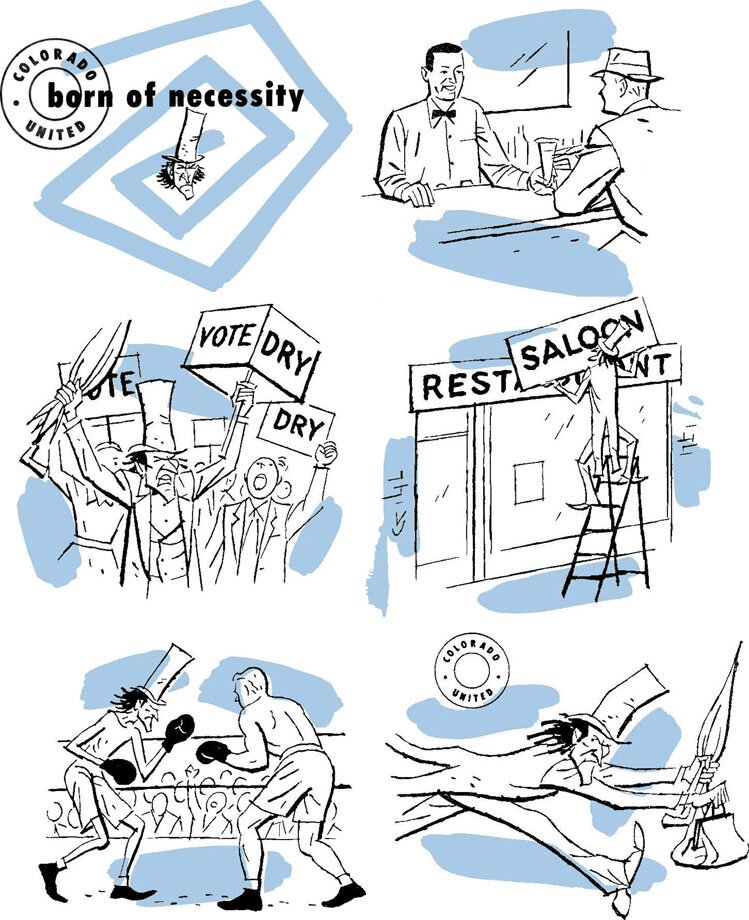
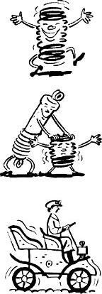
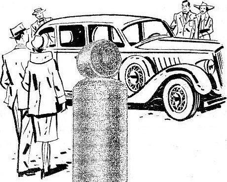
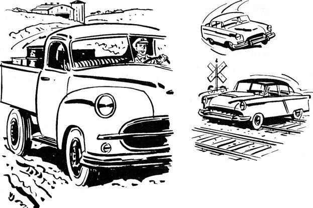
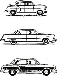
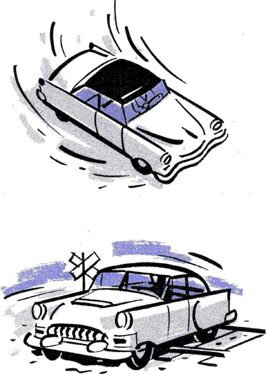
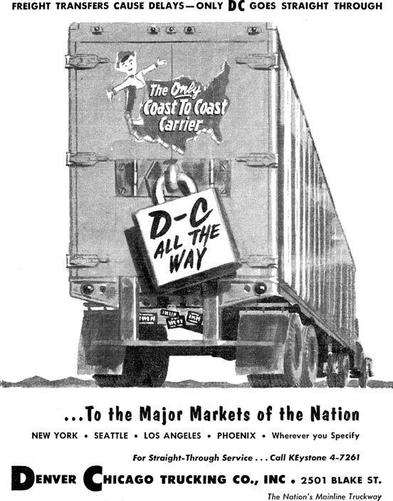
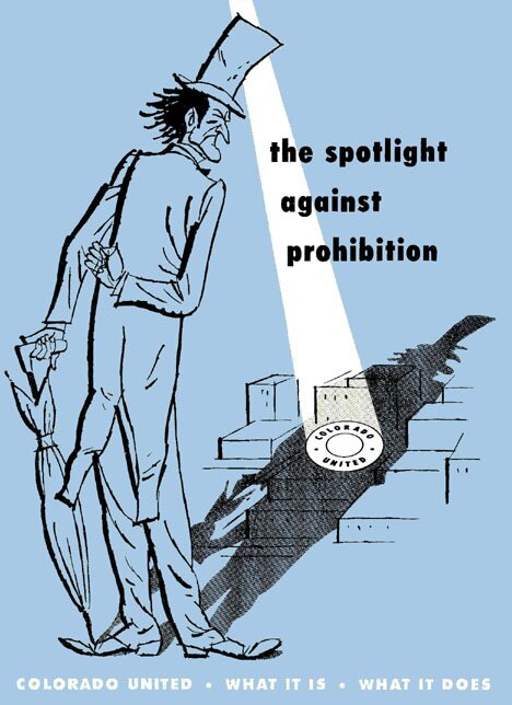
The images below the cover are from the inside, the first one the main heading. The others are selections I arranged for some sort of storyline, if not originally printed in the same order. For instance the fourth drawing, which has my VJ signature, was last when printed. But the idea of course was that people's right to alcoholic beverages be secured and latecoming prohibitionists be defeated by the Colorado United organization.


Resembling the preceding in technique a little is the following more decorative drawing, done as part of some ads for Robbins Incubator Company. A reduced full ad is on the right side—I liked the possibility of subtle shades in drawing a simple object like an egg.

17 January 2005


22 November 2005. I am again squeezing in this image between previous matter, because it is a bit related to the Robbins items above, with also the like two colors. It advertises an imported silk scarf to be gotten for 50¢ with the purchase of Gooch's Best Chick Starter, the meaning of which I don't know but may have to do with the above incubators. I thought the picture pretty enough to add, although I didn't seem to sign it.


As similarly decorative to the preceding carriage, I am including a holiday card I did for the company I worked for, mentioned before. Unlike with the carriage, my signature, VJ, is a bit concealed here, at top left of the large H, above the small light spot. The greeting "Happy Holidays" was not familiar in those days (the 50's), and I wonder sometimes if my use of it was an influence. My idea was to use one capital H repeatedly.


Continuing in a decorative style in the first image below, it is of a cover for a folder for Columbus Shock Absorbers, with more work for the company following. It gave me another opportunity to draw automobiles, which, as mentioned, I like to do and did last of a Jeep here. (I could note I find today's cars largely very ugly, and wonder what happened to industrial design. They seem to all share a variation of an unimaginative V-shaped grill and inexplicably almond-shaped headlights, not to mention bodies of a shapeless potato. In mid last century the Cadillac was so impressively handsome that people wanted one for its looks alone, without needing extolling as advertisers do. Other cars may not have matched it, but they mostly still had nice flowing lines.)

26 January 2005


In the above four-seasons drawings, I signed my VJ in the last one, its top left, likewise the obvious location in the next image, of the bird's-eye view of cheery passengers. The drawings at its right, still cheery, are initial ones in a booklet for the shock-absorber company, with more below. They start by relating some concerned history in cars.
 
 
The present next drawings are in a more serious style, continuing the theme of improvement in shock absorbers through time, with their shadowy depiction here resulting from my lightening what were their photographs, and emphasizing the drawings, which had been printed in a pale color.

The first two are about the 1930's, and the following one below about the then "modern" 50's.


Trucks, like below next, are among other manmade objects that caught my fancy soon. My VJ is at bottom left. This drawing and the two to its right were to in that booklet illustrate varying driving conditions under which the shock absorbers were put to test.


  At the far left, further, the first two cars are also from that booklet and show a bumpy condition and a smooth ride with the shock absorbers. The remaining three pictures were used elsewhere, the last two in two colors and evidently showing the same riding conditions as those directly above.
       

31 January 2005

Having considered automobiles, and now trucks in particular, I am appending an ad done for a different company than the preceding. I only take credit for the watercolor picture (though I don't find a signature); the surrounding typography, which to me is poor other than perhaps the logo, was done by someone else.


MORE WORK FOR COLORADO COMPANIES

To the top and choices