Exploring possible human knowledge


Paul Vjecsner

COMMERCIAL ART

(continued5)

The National Jewish Hospital published a "Patients' Magazine", printed on a Multilith machine, a for today primitive desktop printer, for which one drew right on a printing plate. I was one of the volunteers for drawings.

Below are mostly headings I did for different sections. I didn't spare my VJ signature in them, if faint here. In the first three headings they are found toward the right, in the seventh under the mailbox, in the eighth next to the hat. The last black & white row is of a story in the magazine. In the center is Hamlet's Ophelia, which I signed with a standard signature unlike the VJ on the other two, all bottom right.

A few more comments on some of these. We do seem creatures of habit—I realized that the first picture here is similar in action to one I drew in Prague. I also noticed that my lettering here has bearing on an issue I discussed concerning posters by relations of mine. I complained that those posters, concerning the Holocaust, were totally inappropriate in design, notably by using playful lettering, suited for entirely different subject matter. By an odd coincidence, I used below in the headings for the hospital floors such a style decades earlier to humorously depict scenes in the hospital. Even the previously noted playful nesting of O's in L's occurs (see a like example below). And in the mail-box drawing, I used the light-hearted varied slant of words I likewise mentioned as unfit for a serious message, let alone the tragic one to be conveyed by those posters (more on this on the next page).

28 July 2003

HOME

PRESUMED IMPOSSIBILITIES, continued1, 2

PHOTOGRAPHY, continued1, 2, 3, 4

PORTRAITURE, continued1, 2, 3

COMMERCIAL ART, continued1, 2, 3, 4, 5, 6, 7, 8, 9, 10, 11, 12, 13, 14, 15, 16, 17, 18, 19, 20, 21, 22, 23, 24, 25

INVENTION

AUTOBIOGRAPHY, continued1, 2, 3, 4


25 March 2004

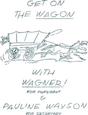
At left is a just found color drawing of mine for this "Patients' Magazine". It may include my VJ signature in one of the hoofs, but I am not sure. Here, too, the lettering is in an above noted playful style, with for instance H nested in T in both cases.


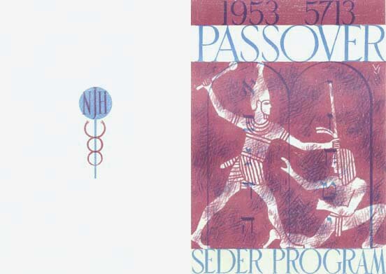
The hospital gave a very nice Seder Service, for which they let me design the program of which at left is pictured the front and back cover. I tried to use two primary printing colors, cyan and magenta, which overprinted on each other yield a third color (in the dates and the tablets with ten commandments), known as blue but appearing violet.

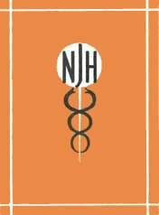
The logo on the back cover, for National Jewish Hospital, is one among a few I also designed for the above magazine, and of which one was adopted more-or-less permanently. Below is a progression of them, the last two the final design in varied colors.


One usually wants logos to be "etched in stone", to give a feeling of stability, and be of a simple symbolic design, usable in many circumstances. I like such a challenge, and the following images are of some of these I created at the job I held in Denver after the hospital. It was a relaxing steady position compared to the previous one in New York. The pace was more easy-going, and I was offered $100 per week, then a decent salary.

4 August 2003


At left are two usages of the logos above them, the first one a mailing piece, I think, and the other a newspaper ad, for both of which I did the layout as well (being an all-around artist at the place).

The small image above is of an entry of the one design in the published annual of the Denver Art Directors Club, following an exhibition of accepted work. The Club was modeled after, and I believe affiliate of, the famous New York Art Directors Club.

I was also given the task of designing the announcement and other literature for that exhibition, and will try next to show some of it.


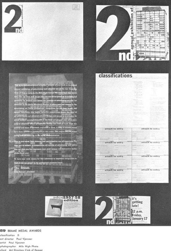
The exhibition was Denver's second one, with the first image below picturing an assemblage I made of my designs for it and one displayed at the same exhibition. To explain, these designs were finished in time for me to submit them to the jury (from the Chicago Art Directors Club) for that show. Some related items follow.

7 August 2003


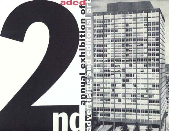
The first two pictures at left are of the envelope and 8½″ by 11″ front of the main mailing piece, a twice folded sheet of which the third picture shows the first unfolding, the second one not included here. The building depicted, called the Mile High Center, housed the exhibit.

The remainders in the image are other mailing pieces. As seen at bottom, I received a medal, a rarity with me.


This is the above front side of the larger mailing piece. The red, or magenta, "adcd" was the actual logo of the Art Directors Club of Denver, with which I tried to harmonize the other typefaces, forms of Franklin Gothic.


This page, 154, appeared in the April 1959 issue of Art Direction, the "Official Publication of the National Society of Art Directors". I did not do the layout but compressed the page somewhat, for the small text to be of legible size.

By that time I had left Denver and returned to New York, but I will attempt to continue here with more work from Denver.


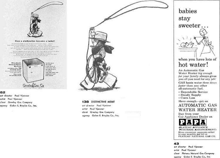
Below are some more of my submissions accepted for that 2nd annual. The drawing in the center, evident as part of the ad at left, was accepted for the "illustration" category, and the "distinctive merit" award was initially lost, my having had to recover it in self-interest. My VJ can be noticed below the boy's rearward leg. The little "PAPA" ad was one of a series, as was the Greeley Gas ad, and I may later include more of these.

12 August 2003


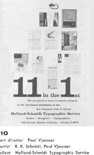
I did this ad for the same printed 2nd annual, in which it also appeared as the above entry. It refers to the accepted entries in the 1st annual from the company I worked for. Its partner Ray Schmidt, also named above, was my boss and created to my knowledge the first three items pictured in the ad.


Using lettering in designs was of course always of interest to me, as seen in what went before. Mostly one resorts to type already designed, as is the case with me here after the above from the hospital. In the last design here I used a font by the type designer Freeman Craw and was obviously interested in the theme created by the number 1, etc.

To turn to the items I did that are pictured in this ad

SEE MORE WORK FROM DENVER

To the top and choices