Exploring possible human knowledge


Paul Vjecsner

COMMERCIAL ART

(continued12)

Continuing with work done for Hamilton investment, the following is from a brochure for which someone else did the layout, a bad one in my view. He was art director for Hamilton for a short period, and I was given to do these illustrations, this time in full color. For this webpage I substantially enlarged them, because otherwise many of the details, like brushstrokes, were lost. I also rearranged for present purposes some of the pictures and titles, which are nonetheless those used in printing.

4 March 2005

HOME

PRESUMED IMPOSSIBILITIES, continued1, 2

PHOTOGRAPHY, continued1, 2, 3, 4

PORTRAITURE, continued1, 2, 3

COMMERCIAL ART, continued1, 2, 3, 4, 5, 6, 7, 8, 9, 10, 11, 12, 13, 14, 15, 16, 17, 18, 19, 20, 21, 22, 23, 24, 25

INVENTION

AUTOBIOGRAPHY, continued1, 2, 3, 4


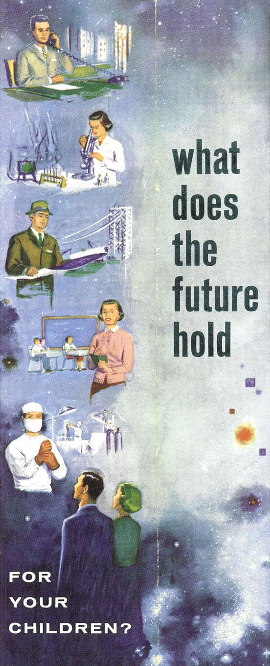
This painting (in opaque watercolor) was done for part of the cover and spans both the back and front cover, with the fold (right of center) visible. There is really much I didn't like about the layout, as indicated with an early poster; I don't like cutting off bodies to arbitrarily fit them into a background, instead of placing them appropriately; the combination of typefaces is also unattractive to me, as is their absence of flow in reading them together (the large type was actually repeated on the back cover, and the small one on the front cover); and planning the illustrations for the back also doesn't make sense, with only a small photo, not shown here, in front.

Nevertheless, I liked to do the modeling of subjects in color.


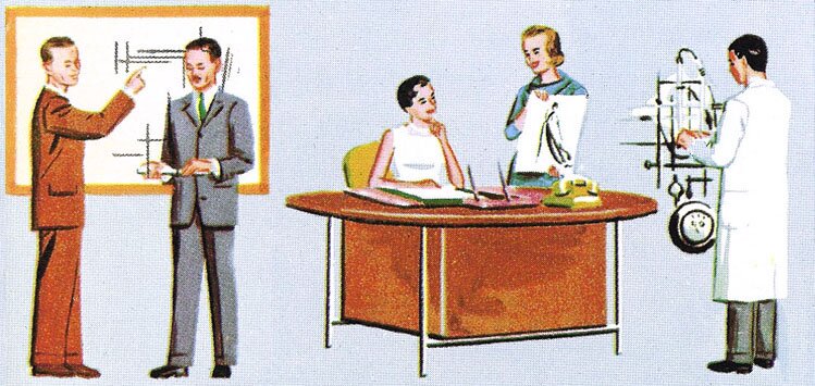
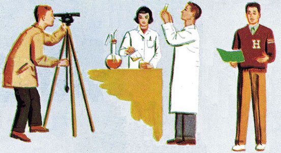
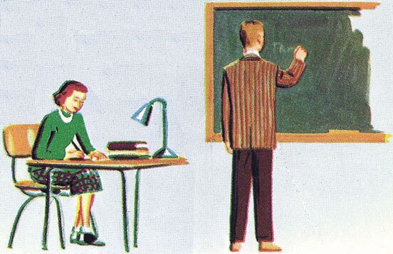
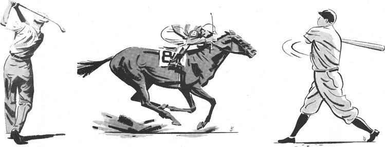
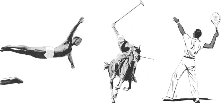
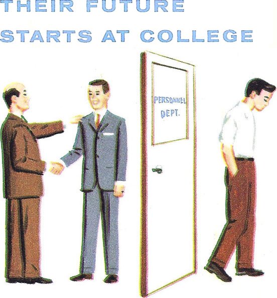
These inside images are in sequence. The first one, at left, is used here as printed, with the typeface in this case less objectionable to me.


The idea in this brochure was for parents to invest in the mutual funds in order to provide for future college education of their children, who would afterward be better prepared for eventual careers.

Some of these drawings seem to display after-effects in colors, like the blue and red edges on the trousers at left. These result from imprecise "register", fitting of printing plates, which is noticeable here because of the enlargement.


The two pictures above and below contrast jobs based on better education and the lack of it. Debasing the second seems demeaning.


I rather liked drawing, beside all kinds of people, machinery again, including reflections on its shiny surfaces.

The next two pictures, at left and below, illustrate extracurricular activities.


The point was made that these activities help students develop well-rounded personalities.


This last picture, of happy graduates and parents on campus, is self-explanatory.


Following are some more realistic illustrations, for a series of ads for Denver Wholesale Florists Company. The quality of its products is compared to achievements in various sports, as depicted. The drawings are done after photographs except for the first one, which is a composite, The deepest blacks were painted with undiluted India ink, to which tones were then added.

10 March 2005


The full ad here shows the basic design used. I don't really like fishing or hunting, except for needed food.

The sports below should be evident. Babe Ruth will be probably recognized, in one of his famous poses, and the last picture is of Bill Tilden, an early champion in tennis.

On these drawings I didn't spare my VJ, unlike in the preceding color ones.


DENVER CONTINUED To the top and choices