|
PRESUMED IMPOSSIBILITIES, continued1, 2 PHOTOGRAPHY, continued1, 2, 3, 4 PORTRAITURE, continued1, 2, 3 COMMERCIAL ART, continued1, 2, 3, 4, 5, 6, 7, 8, 9, 10, 11, 12, 13, 14, 15, 16, 17, 18, 19, 20, 21, 22, 23, 24, 25 AUTOBIOGRAPHY, continued1, 2, 3, 4 |
|
|
|
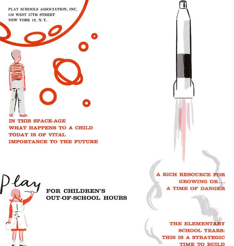
Added below is another small item for the Play Schools Association. On the cover, at left, I replaced the printed drawing with the one I did on the layout, because I like it better. It is sketchier than the others, since done with a charcoal pencil instead of a brush. Computer editing facilities now allow removing traces of such a patch-up job. 23 December 2005 |
 |
 |
|
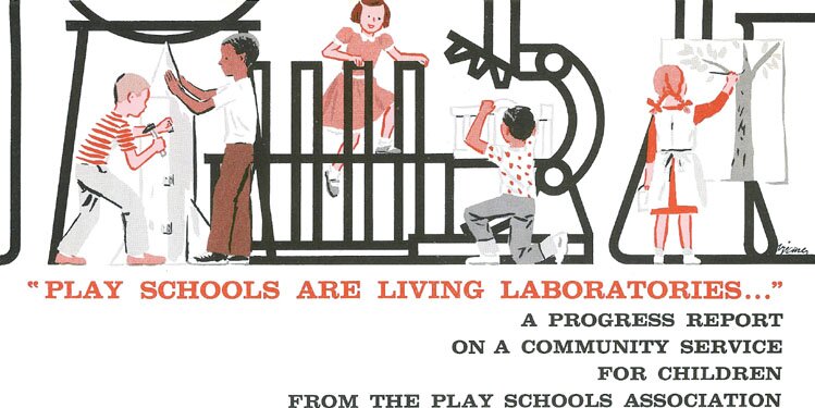
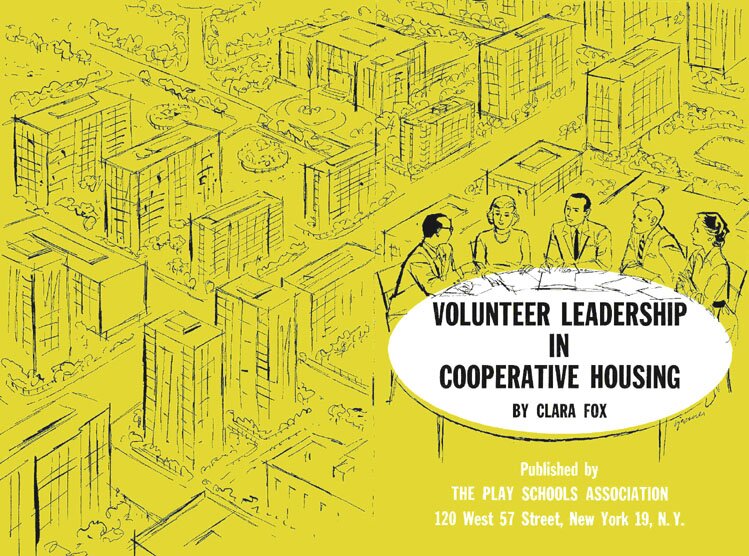
12 January 2006. Below I am again squeezing in material, to precede the one on the Visiting Nurse Service. The reason is that I found this also to be for the preceding Play Schools Association, although the pictures indicate no play or schools, and it is of a booklet the back and front cover of which is in the first image, somewhat reduced to fit. |
 |
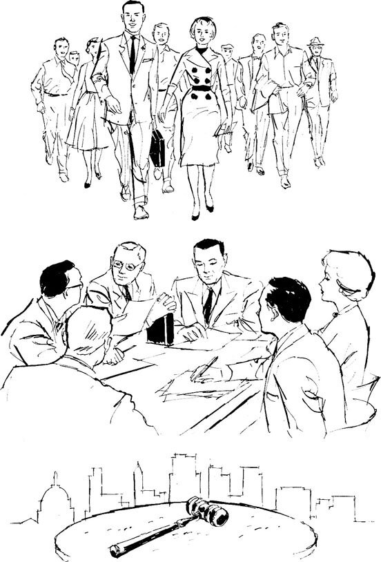 |
The cover has at bottom right my last name again, like the first image on this page. I felt it would be interesting that I make the white ellipse delimit the tabletop. Unlike the cover, the inside illustrations at left are enlarged, since the thinner lines, weakened in print, do otherwise not show up. The drawings are meant to represent the community spirit, planning, and conferences. |
|
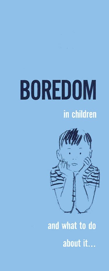
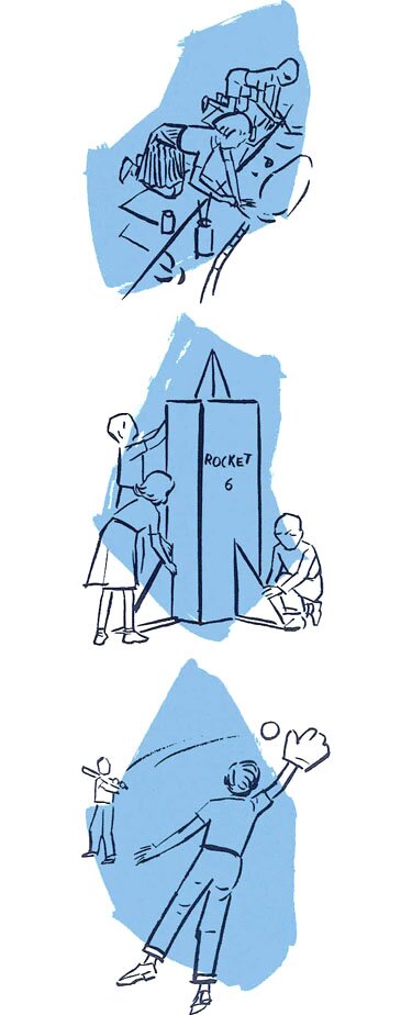
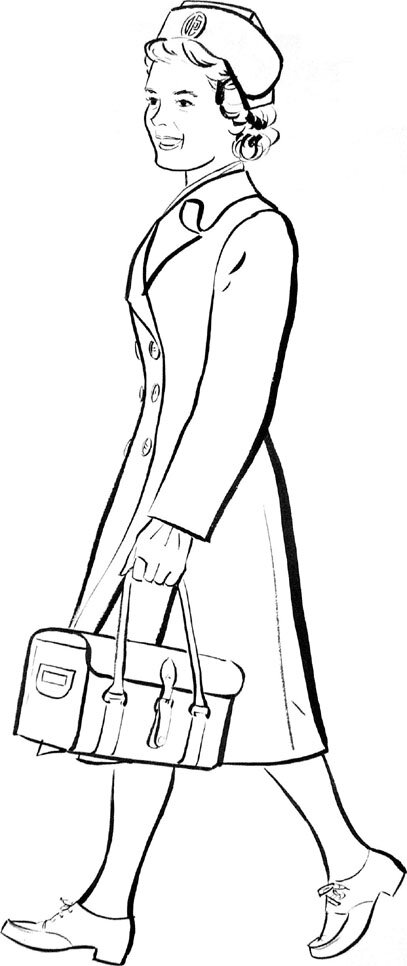
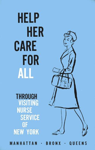
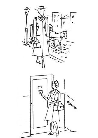
(This earlier text refers to the above cover on boredom in children.) That a job's earlier sketch or drawing be more to my satisfaction than the final version happened more than once. Below is a first drawing at left, which was out, and in the blue image at right the second drawing, which was in. As evident, it was of a visiting nurse, and the organization preferred a high-fashion figure to that in the first drawing. I felt it more appealing to show a simple working girl. Under the blue image are two more drawings for the Visiting Nurse Service, picturing in one a scene at the beginning of the organization, and in the other a contemporary one. 30 December 2005 |
 |
|
|
|
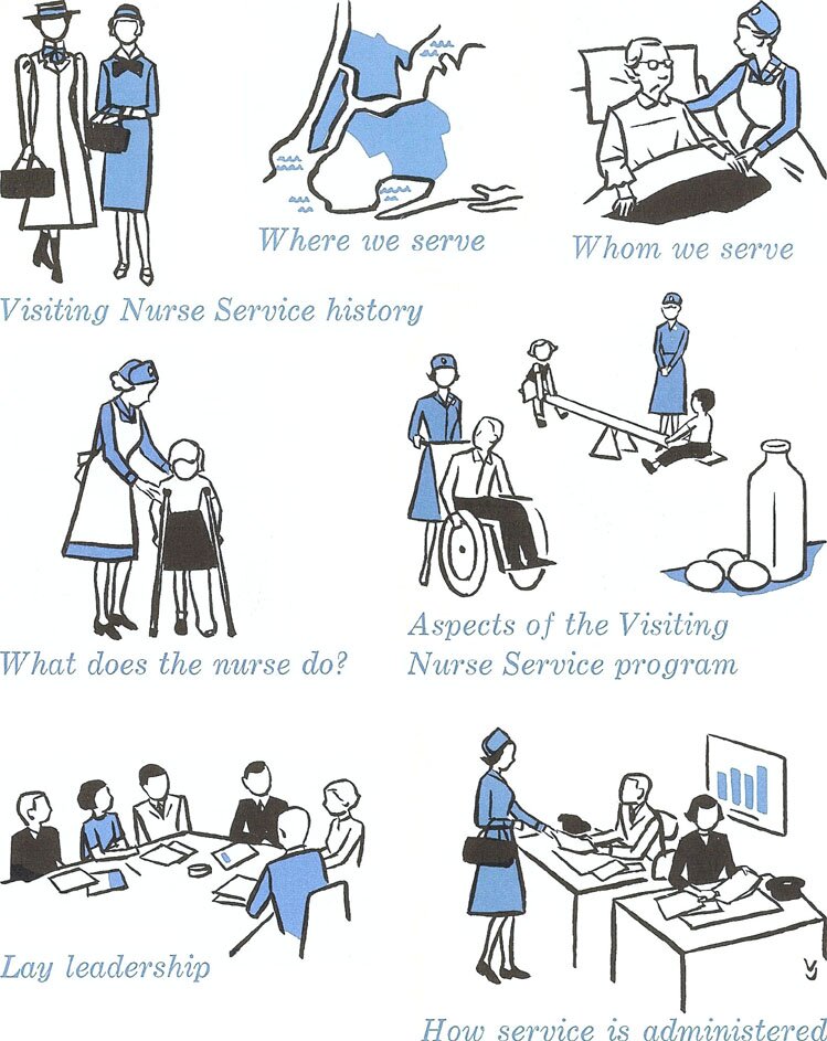
Below are some more drawings for the Visiting Nurse Service, with corresponding titles used. It may be interesting that the little map shows, in blue as applicable, Manhattan, the Bronx and Queens, but not Brooklyn. This time I have my VJ again at the bottom. 5 January 2006, another year, for my 80th birthday. |
 |
| MORE OF COMMUNITY SERVICE | To the top and choices | |